Revitalizing customer facing product pages to make shopping for health insurance an easy and well informed process.
Project
United Healthcare product page modernization
Client
United Healthcare
My Role
UX/UI Designer
Timeline
8 months
Overview
The Problem:
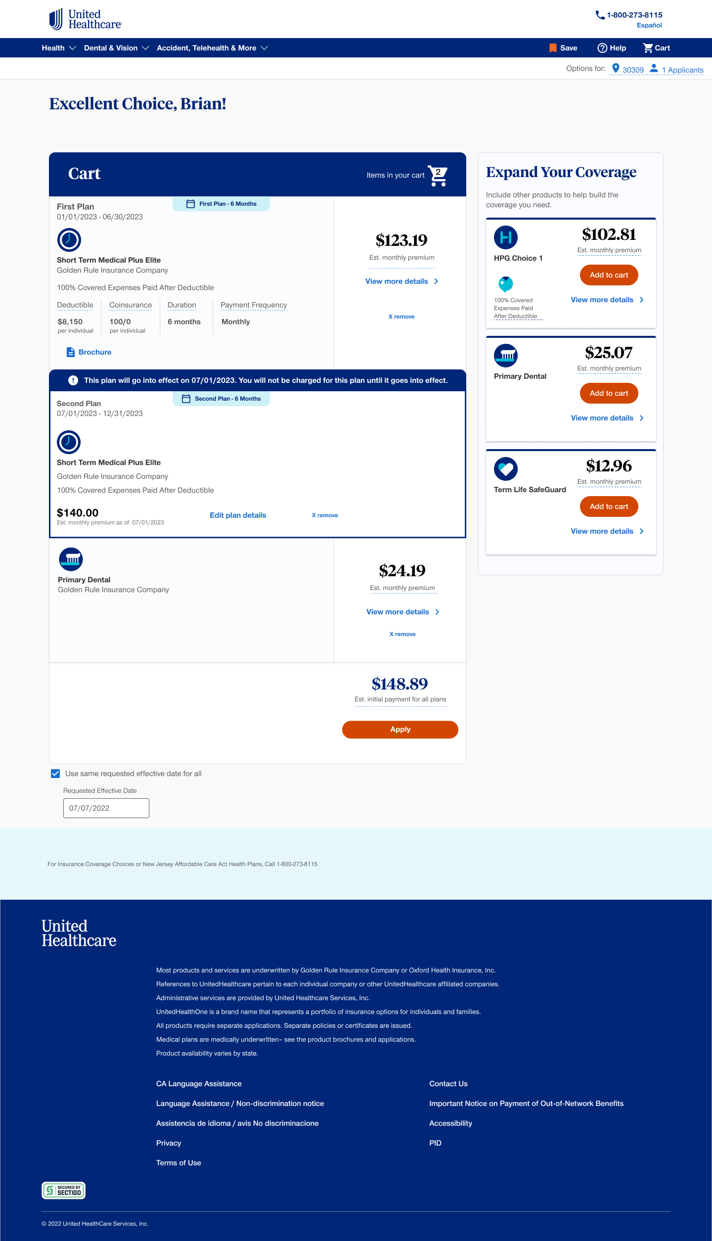
Navigating healthcare options is inherently complex, and for United Healthcare, an outdated digital presence was only adding to user friction. The existing website suffered from convoluted product page mapping, making the buying process confusing and difficult to follow, while the underlying design system struggled to meet modern accessibility standards. This fragmented digital experience created an urgent need for a comprehensive overhaul to modernize the platform's look and feel, ensure strict accessibility compliance, and ultimately make shopping for healthcare intuitive for all users.
The Solution:
To resolve these usability and compliance issues, the strategy was to build upon their foundational design language to create a robust and highly accessible component library. The solution was to design standardized UI components that could be seamlessly shared across the entire organization. This directly empowered engineers updating the live site and go to market teams developing new sales training. Beyond updating the core system, the solution also involved conceptualizing new user focused features that were previously missing. We introduced an AI agent and dedicated glossary pages to demystify complex terminology and create a much more supportive shopping experience.
My Contributions
Who I worked with:
Designers
Collaborate on component designs, rapid prototyping of new product pages, and update existing design system items for new requirements
Engineers/Devs
New component implementation, product page launches, and new product page mapping implementation
Product Owner
Map out new product page experience, create user journey maps, and highlight key go to market needs for component updates
What I did:
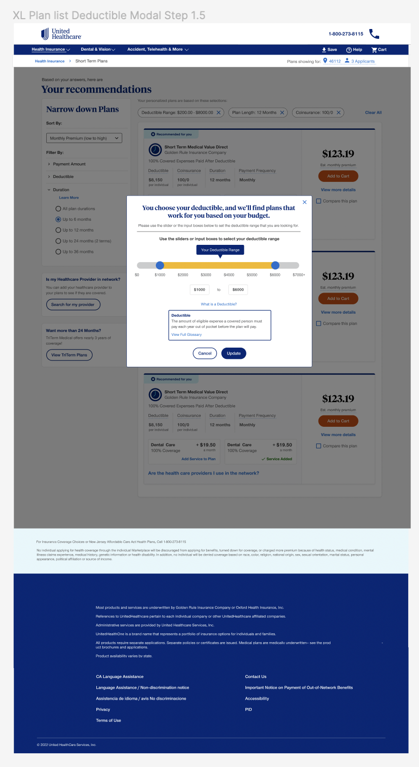
To improve the convoluted shopping experience, I partnered directly with the product owner to architect new website pathways that simplified the overall user journey. As part of a collaborative effort with two other designers and a team of developers, I also drove the modernization of over 100 interfaces to meet full WCAG accessibility standards. Within this larger overhaul, I owned the design and functional mapping of a new AI chat assistant built to help users navigate complex insurance options. Through our shared design system and close alignment with engineering, we were able to implement these new components efficiently and cut implementation time by 40 percent.
Key deliverables:
-
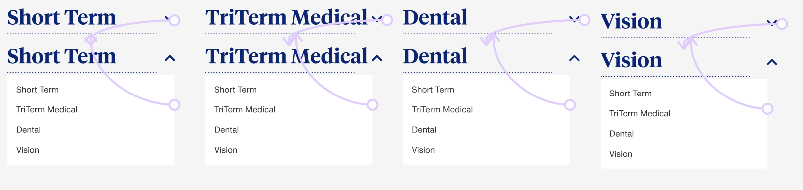
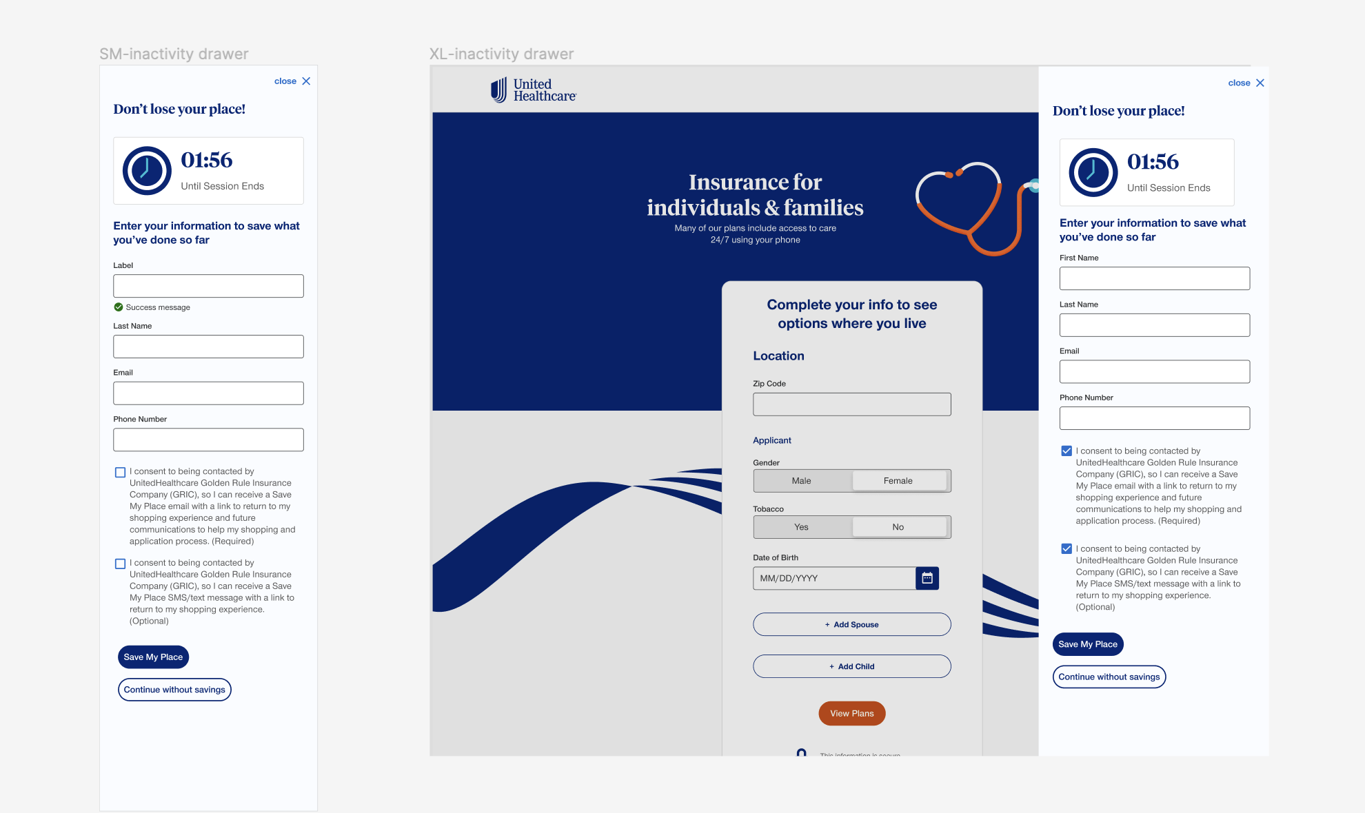
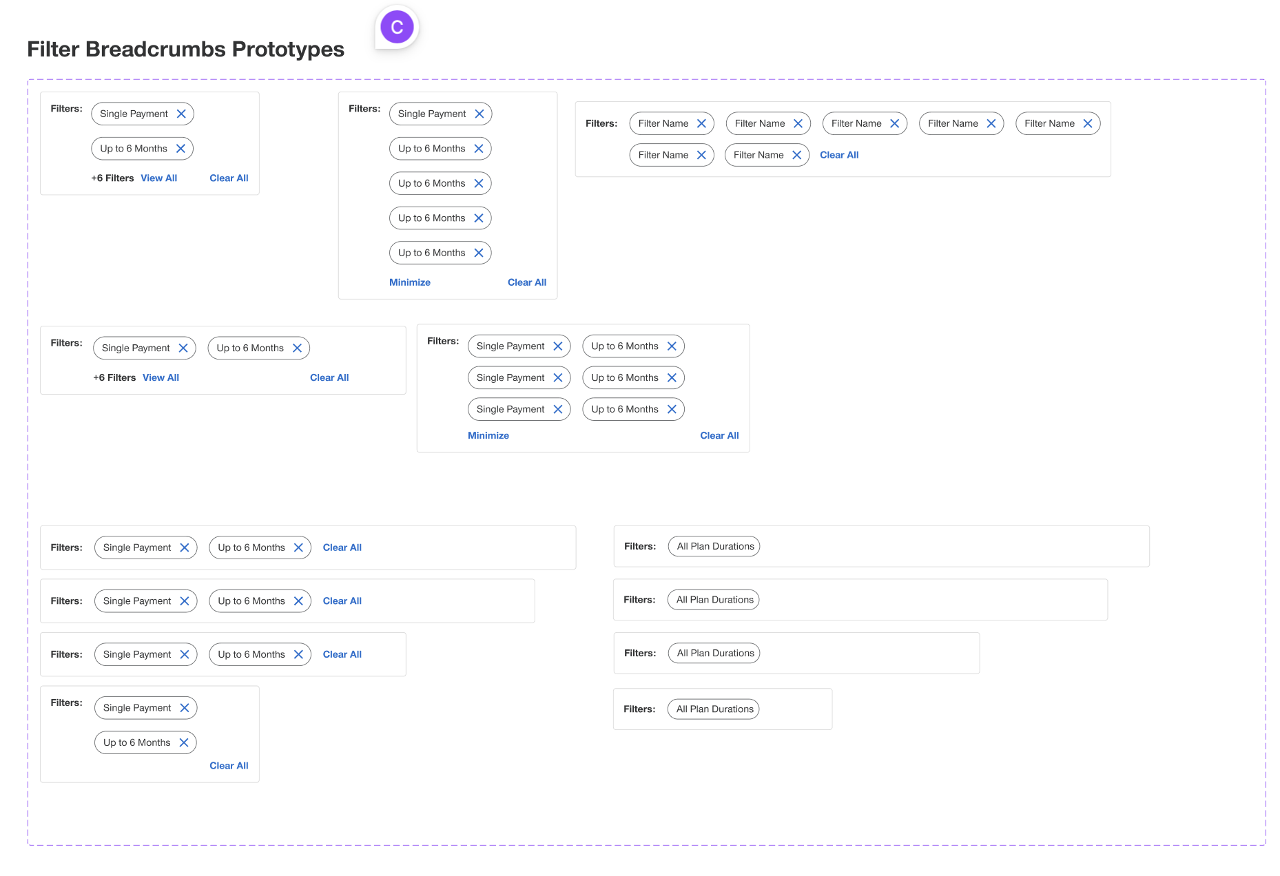
The existing design system had basic colors and typography but lacked reusable and accessible components. Working alongside two other designers and a team of developers, I built out these new components so that both engineers updating the live site and go to market teams building sales training had a shared compliant toolkit. This structural alignment successfully modernized over 100 interfaces and accelerated our implementation cycles by 40 percent.
-
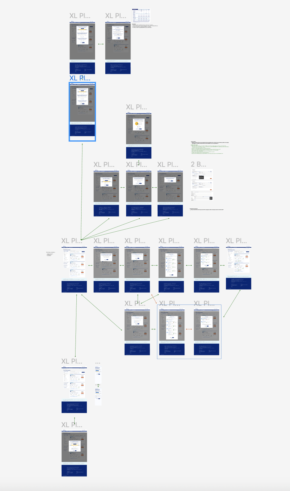
Shopping for healthcare is inherently complex, and the existing site mapping made the buying process convoluted and frustrating. I partnered directly with the product owner to rethink and restructure these pathways. Simplifying the digital architecture was absolutely necessary to reduce user friction and guide members intuitively through the process of selecting the right insurance plan.
-
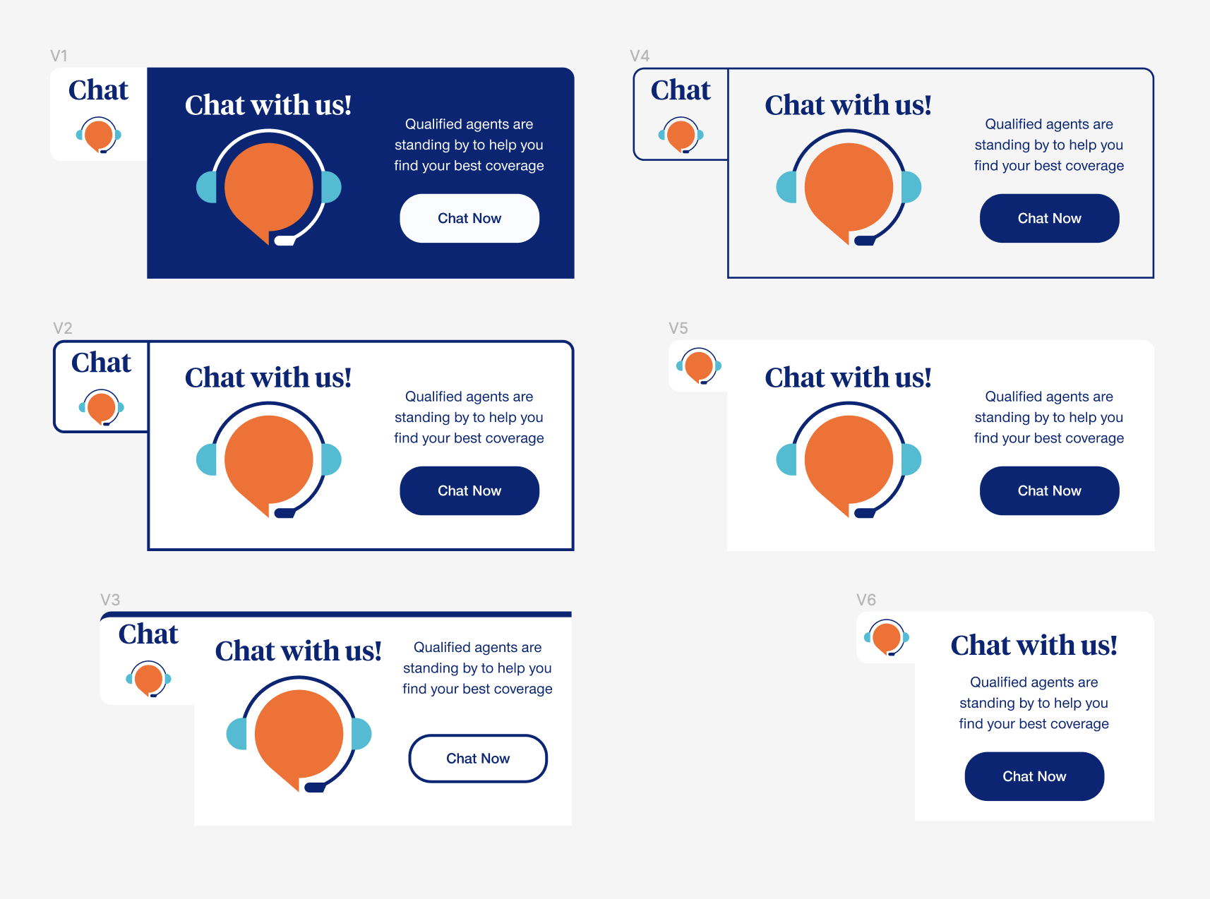
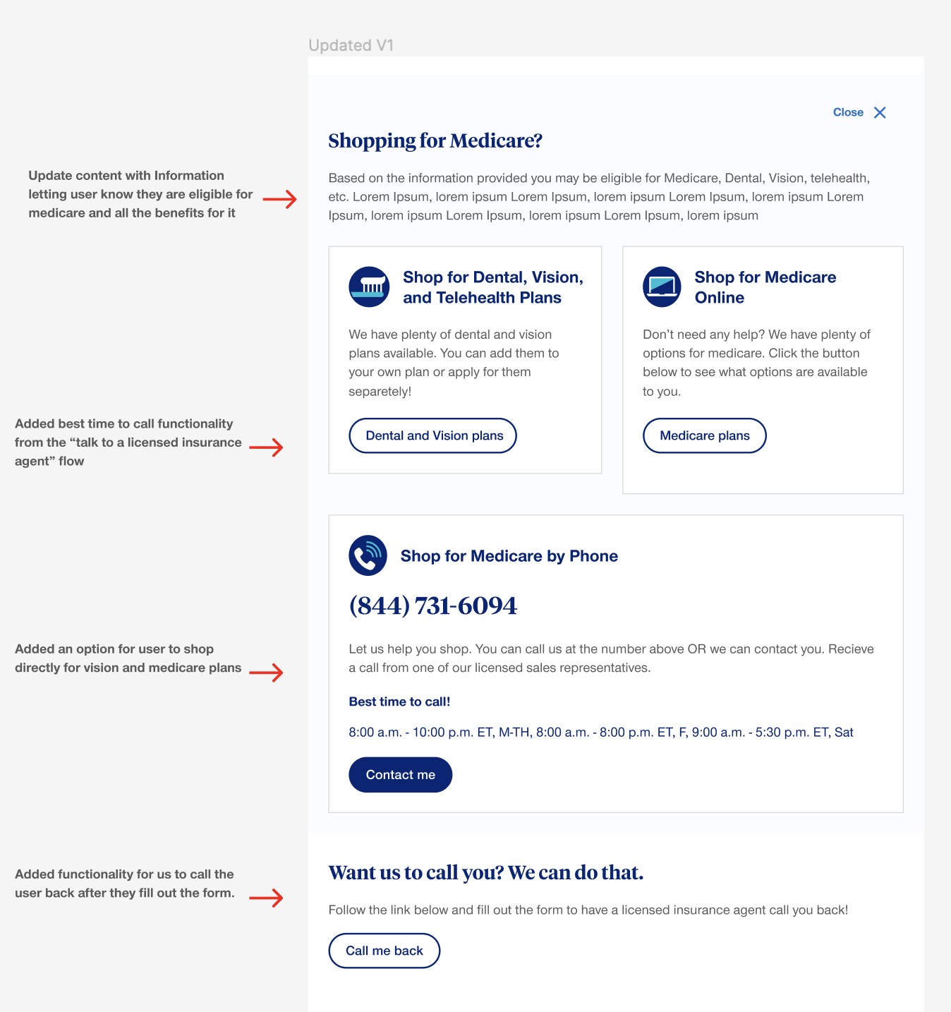
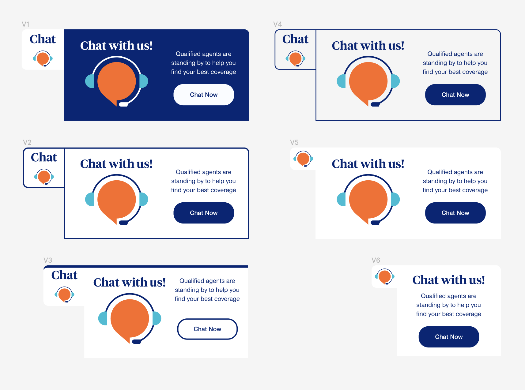
Users needed immediate guidance while navigating dense insurance options, but the existing platform lacked interactive support. I took direct ownership of designing a brand new AI agent and mapping out exactly how it would function within the broader product ecosystem. This proactive support tool was conceptualized to intercept users when they encountered difficult decisions, keeping them engaged and supported throughout the shopping experience.
-
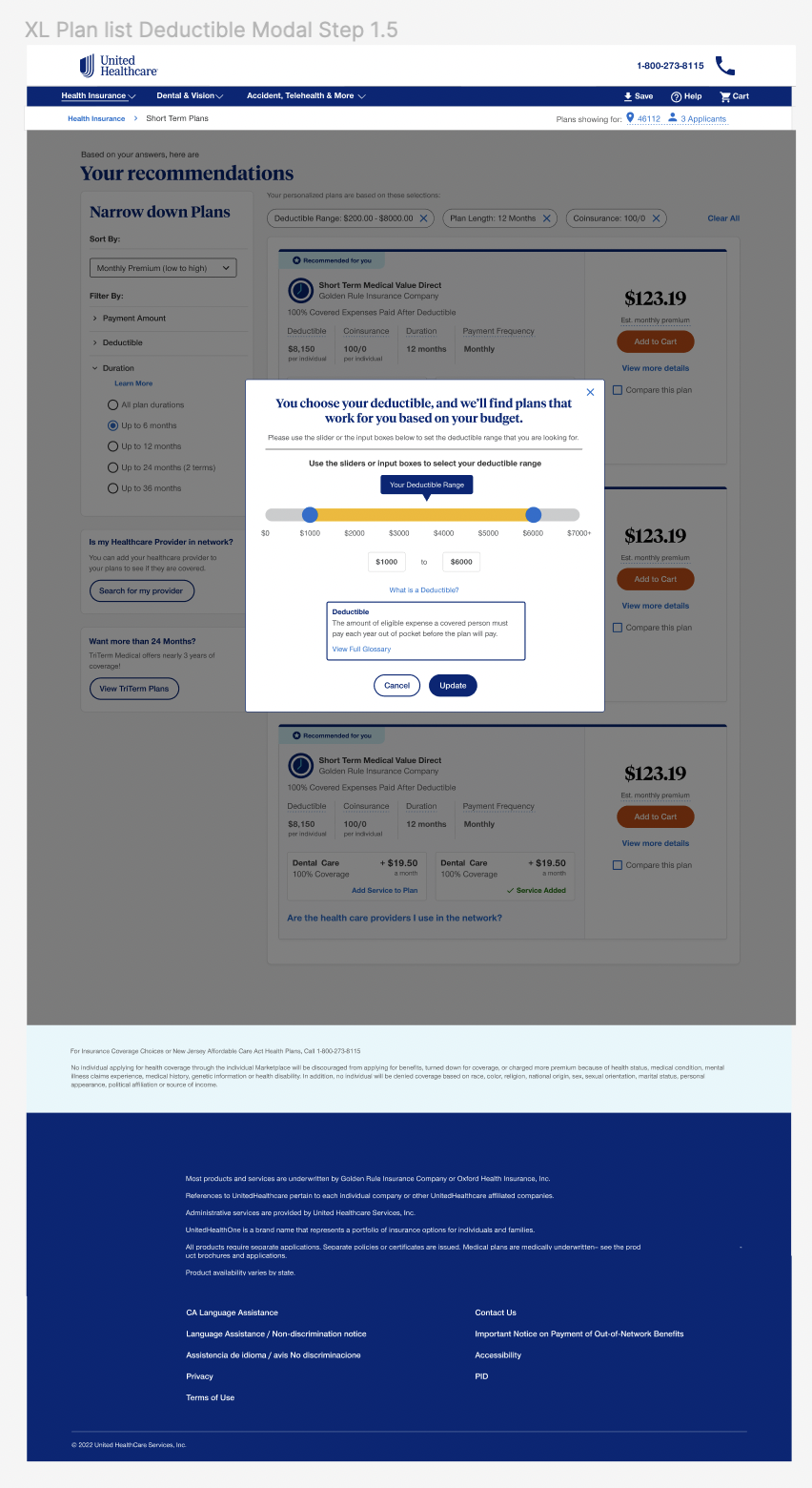
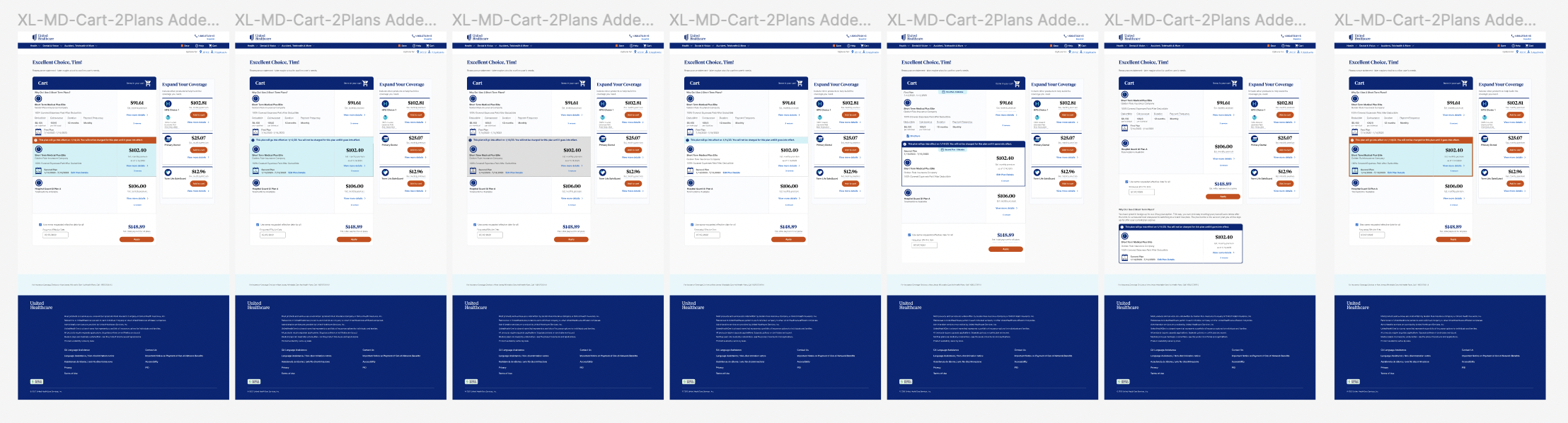
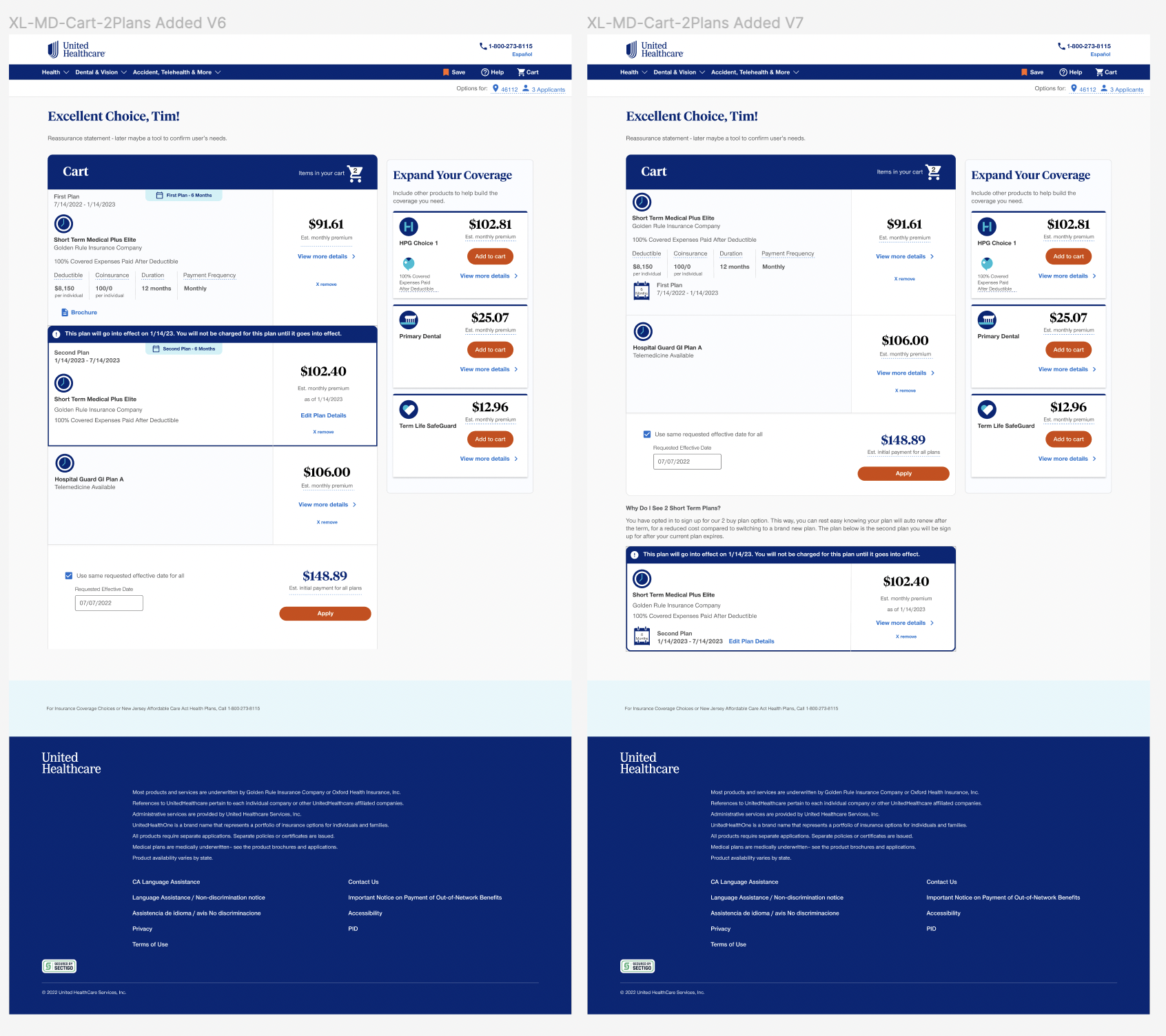
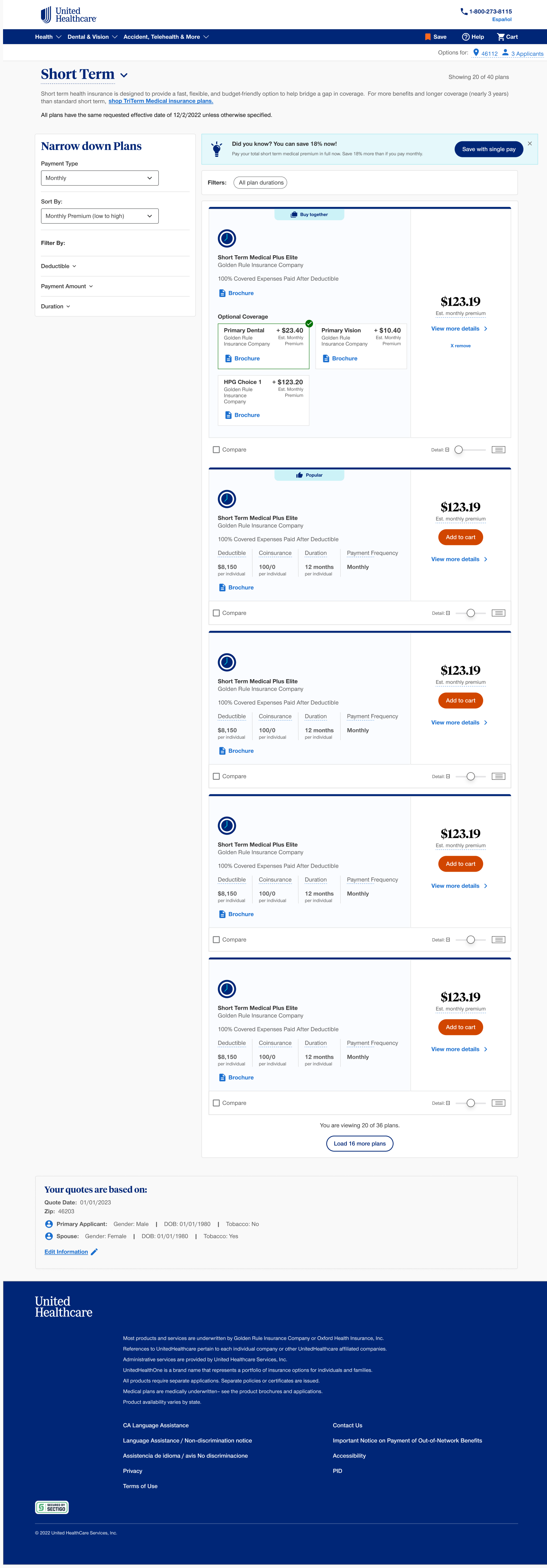
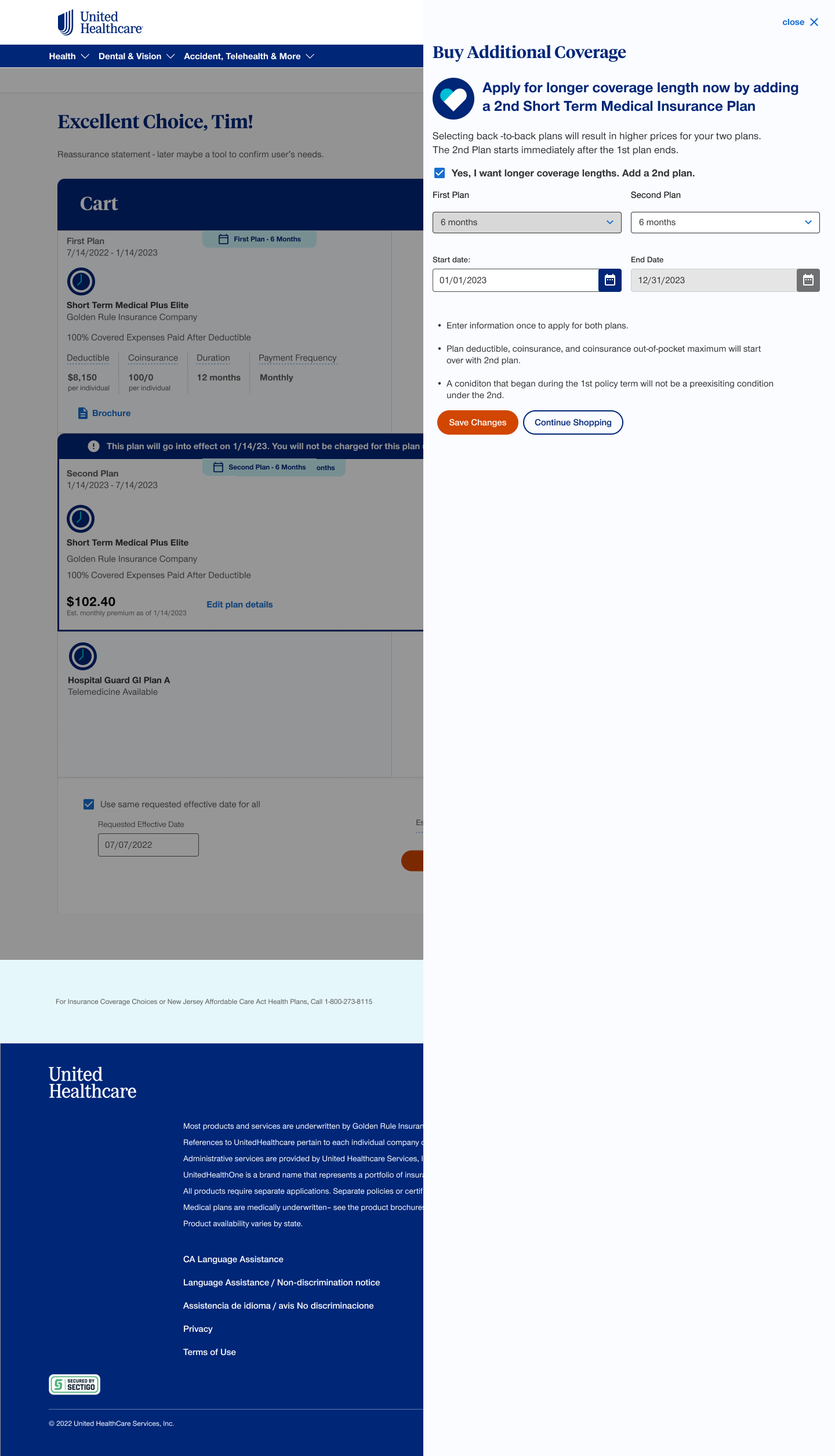
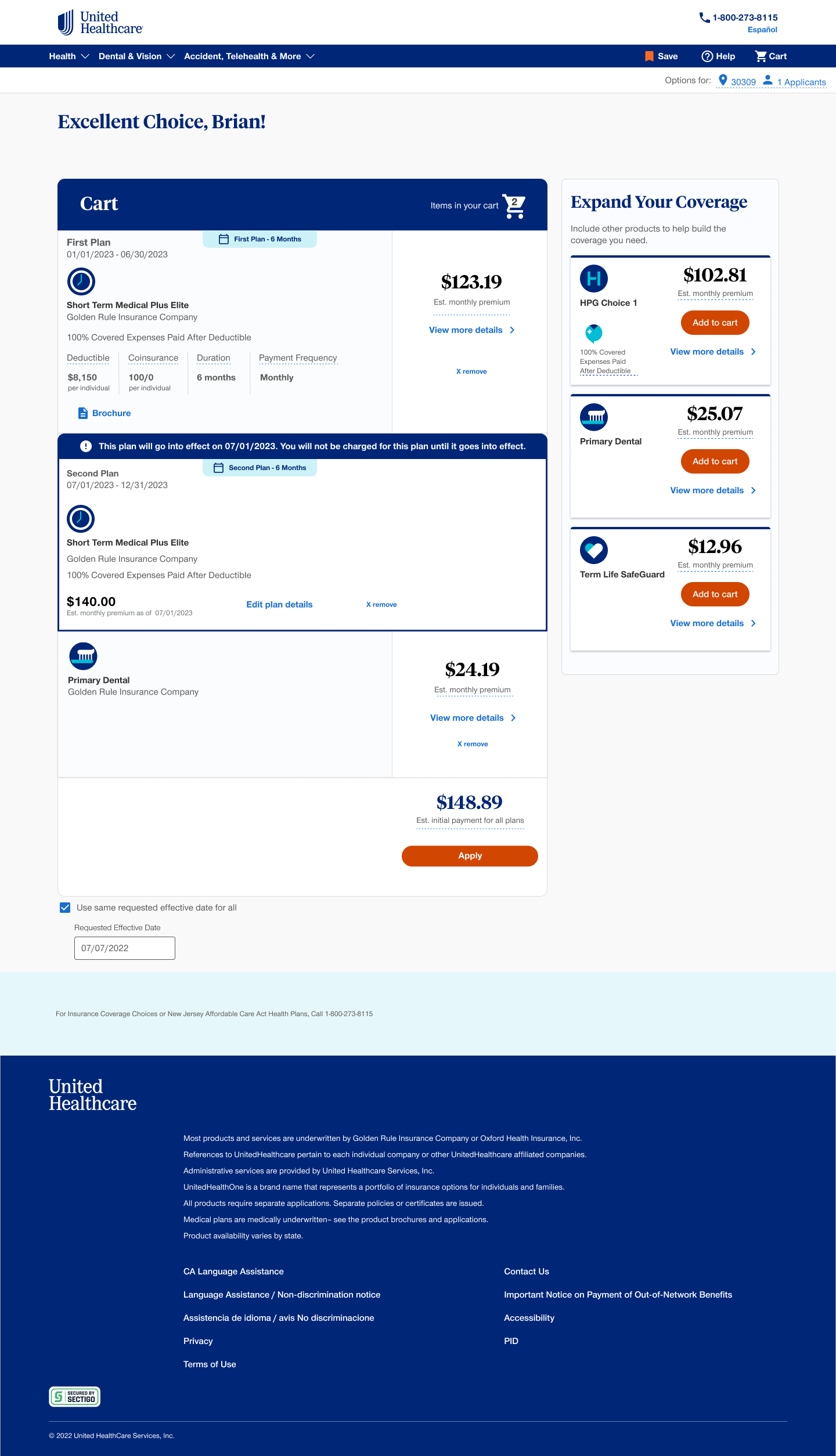
The original product pages suffered from text-heavy layouts and confusing hierarchies that failed to engage users or clearly explain coverage options. I completely redesigned over 30 core product pages to bring them into a forward-looking, modern aesthetic. This entailed reorganizing complex insurance details into clean, scannable layouts, implementing the new accessible components, and providing clear calls to action to guide users confidently toward enrollment.